 |
| Inbound and Outbound Tourism, Watson Analytics |
Yup, it is Friday again and the weekend is coming closer and closer. The
Carnival or
Fasnet/Fastnacht season is close to its peak and some school holidays and inofficial holidays are coming up late next week. Tourists are pouring into carnival strongholds. Why not take some time today to test drive the
Bluemix Analytics Exchange and
Watson Analytics with tourism data and try to get some insight?
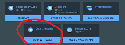
I started my endeavor by logging into
IBM Bluemix. Then the dashboard comes up and one of the five groups is labeled "Work with Data". This is the one to click as shown in the screenshot below:
 |
| "Work with Data" on Bluemix |
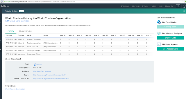
On the left are icons to switch between the Services (create and view data-related services), the Data (create connections to databases to import data), the Analytics (with Apache Spark) and the Exchange tasks. When clicking "Exchange" Bluemix brings up a screen to either directly pick one of the featured data sets or search for open data in its catalog. I searched for "tourism" and then selected the "World Tourism Data" from the results. Next are details on that data including the data source, usage terms, a description of columns and a glimpse on the data itself (see image below).
 |
| World Tourism Data, read for analytics in Bluemix |
 |
| Data Set in Watson Analytics |
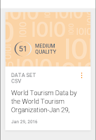
As I wanted to look at the data with Watson Analytics I clicked the "Explore Data" button on the right. After providing my login credentials I confirmed that I wanted to copy over the data to Watson. The data is imported, analyzed for its structure and quality, and an entry on the Watson Analytics workspace created. As can be seen on the right, the data has medium quality and was imported today, January 29th.
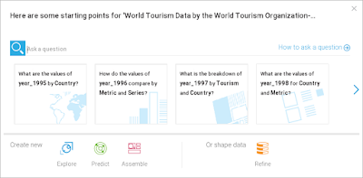
I decided to first try out one of the questions suggested by Watson Analytics and later, in a second step, to refine and improve the data set and retry posing questions. Your options are visible after clicking on the data set. I picked the suggested question "What is the breakdown of
year_1997 by
Tourism and
Country?" The three terms related to three columns in the data which Watson apparently considered to be important columns.
 |
| Your data in Watson Analytics - now what...? |
 |
Hide columns
Watson Analytics and IBM DataWorks |
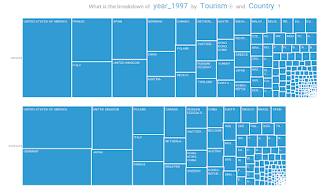
After pressing the icon for that question, Watson starts processing. While the system is working on the data and visuals, the animated Watson logo (avatar) that you probably have seen on
Jeopardy and in
Watson commercials is used to bridge time. And then, after few seconds, a first graph is presented to me. It is the one shown on the top of this blog for inbound and outbound tourism. Countries with more tourists are represented with a larger share of space. On the bottom of the page are options to refine the data, to use different visuals, etc.
 |
| Composing a filter |
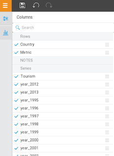
Following my plan, I moved on to refine the data. This is similar to working with the
IBM DataWorks service on Bluemix. It is possible to hide or rename columns, apply filters against the data, compute or aggregate values, and more. To remove columns with footnotes and explanations I hid them by deselecting them. As seen, it were the "Rows", "NOTES", and "Series" columns.
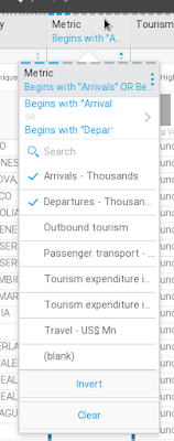
Next I took a look at the "Metric" column which mixed people count with revenue. Thus, I filtered for values that were either showing the arrivals or departure count for tourists. This can be done by clicking on the column header, selecting "Set condition" and then composing the filter. In my case it was a "begins with" predicate for the arrivals and the same for the departures combined with an OR. "Done" and applied, the data looks much better. Why not create another visual? But first I saved the data. This causes Watson Analytics to list two data sets, the original one and another one labeled "refinement" (which also has a higher data quality score). It is also possible to give the improved data set another name.
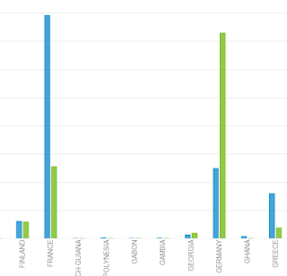
After picking the refined data and I typed in a question myself. Watson took it and suggested alternatives to my question. We agreed on "How do the values of
year_2008 compare by
Country and
Tourism?" Watson created a chart which I didn't find too impressive. Hence I clicked on the graph type selection and chose a bar chart. Here is a section out of the result, showing the data for some countries including France and Germany. Guess which color represent inbound and outbound tourism? What is more popular, the
Eiffel Tower or the
Oktoberfest (or Carnival)...? Anyway, enjoy the weekend and take some time to explore the Analytics Exchange and Watson Analytics.
 |
| Germany vs. France for inbound and outbound tourism |


